


Most feedback programmes run across multiple channels. Email, SMS, website embeds, QR codes, social posts. But ask which channel is actually pulling its weight and most teams can't answer with confidence. Responses come in. Scores move. Nobody knows which send, which link, or which campaign is doing the work.
That's a problem when it's time to plan the next round. Budget gets split evenly across channels that perform very differently. Weak channels get repeated because nobody noticed they were weak. Strong channels get under-invested because nobody noticed they were strong.
Response Count Charts fix that.
Add a Response Count chart to any dashboard, switch on the collector breakdown, and you'll see exactly how many completed responses each channel has generated. Email versus SMS. Embed versus pop-up. Campaign A versus Campaign B. All in one view, updating live, filterable by date.
The next time you're deciding where to spend invites, you'll have the evidence.
What you can do with it
- Compare the performance of every distribution channel you use on a single survey
- Spot which campaigns are carrying a programme and which are dragging it down
- Stop sending to channels that don't convert, without waiting for a quarterly review
- Build a case for the channels worth doubling down on, backed by live response data
- See response trends over time, alongside the scores they're generating
How it works
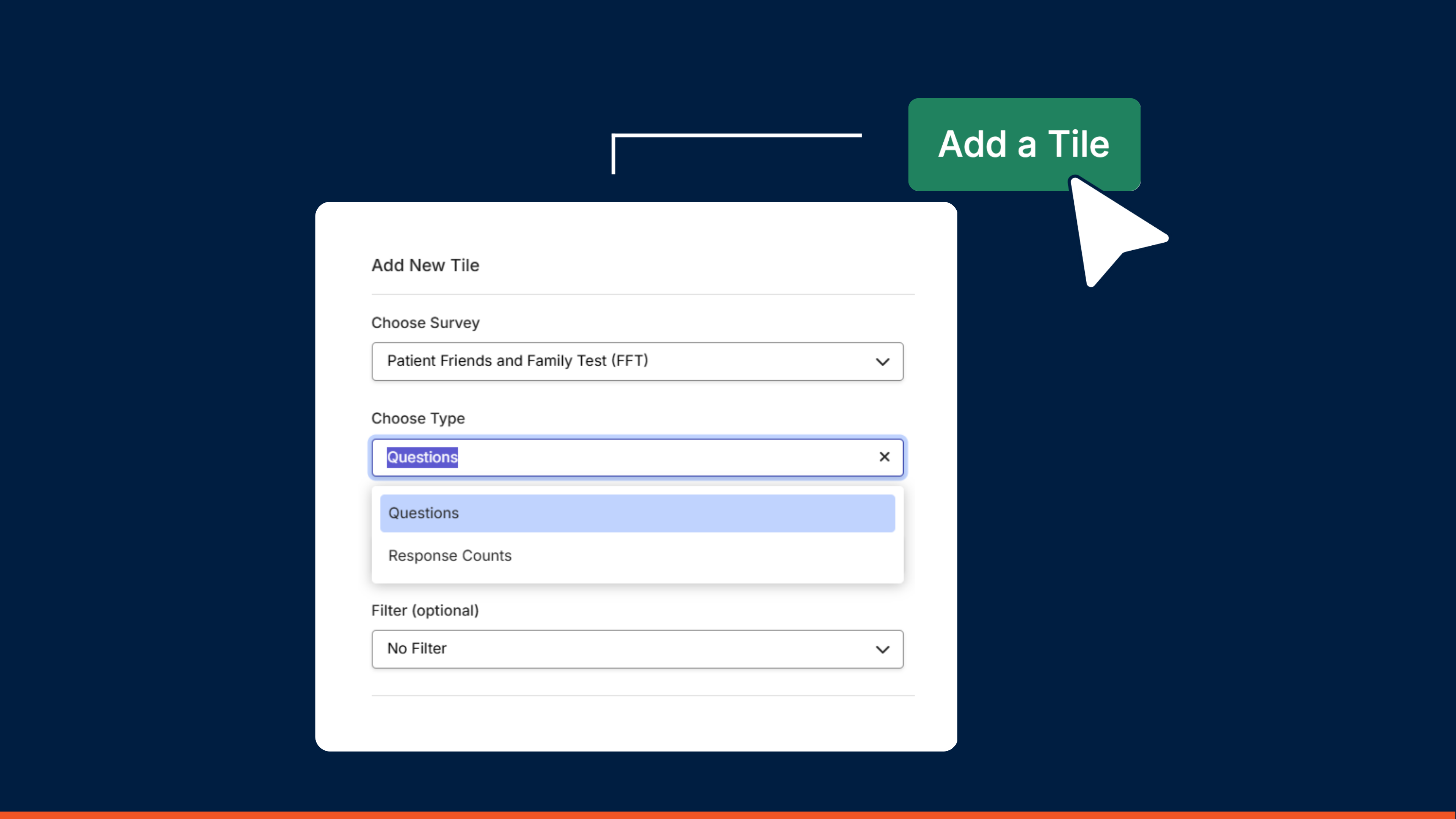
Open a dashboard, add a new chart tile, and choose Response Count as your data source. Apply any filters you need, then save. A live chart of completed responses appears alongside your scores.
To break down by channel, open the chart settings, select Breakdown, then Collector. Each collector link becomes its own series. Only collectors with at least one response show up, so the view stays clean.
Everything responds to the filters already applied at tile or dashboard level, including date quick filters, so you can slice by week, month, campaign, or any custom segment.

Where to start
Try it on the survey you distribute through the most channels. That's where the biggest surprises usually sit. Compare the last 30 days, see which channel is carrying the programme, and let that shape where you spend next.
Response Count charts are available now on Growth plans and above.
Helpful Links
Get started and create your first survey


