
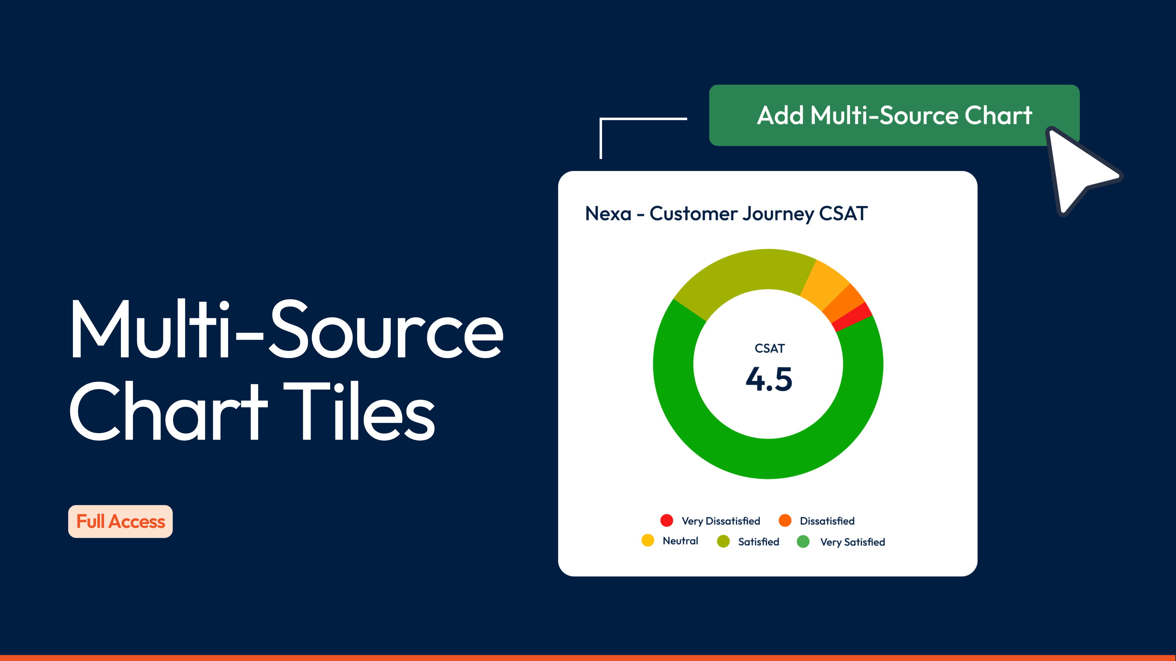
Multi-Source Chart Tiles: See the complete picture across all your feedback touchpoints
Aggregate all of your data such as NPS, CSAT and CES scores into single chart that show your complete picture across all feedback.
Multi-Source Chart Tiles combine responses from multiple questions into one chart, automatically calculating total scores across all your selected questions. Whether you're tracking NPS across five different surveys or combining satisfaction scores from ten questions in one survey, you get one unified view of what matters most.
Why we're excited about Multi-Source Charts
One of the most common requests we've heard is: "How do I see my total NPS or CSAT across all my surveys?" The answer used to be "export everything and calculate it yourself." But that never felt right.
The limitation was blocking people from using dashboards effectively. If you couldn't aggregate your key metrics inside SmartSurvey, you'd end up building reports elsewhere. You'd lose real-time updates, lose the ability to share live dashboards, and spend hours on manual work that should be automatic.
This changes that completely. Your most important metrics can now live where they should, in dashboards that update automatically and share effortlessly across your organisation. Whether you're tracking customer satisfaction across ten different survey programmes or measuring employee sentiment at every stage of the employee lifecycle, you finally have one source of truth that stays current without any manual effort.

How it works
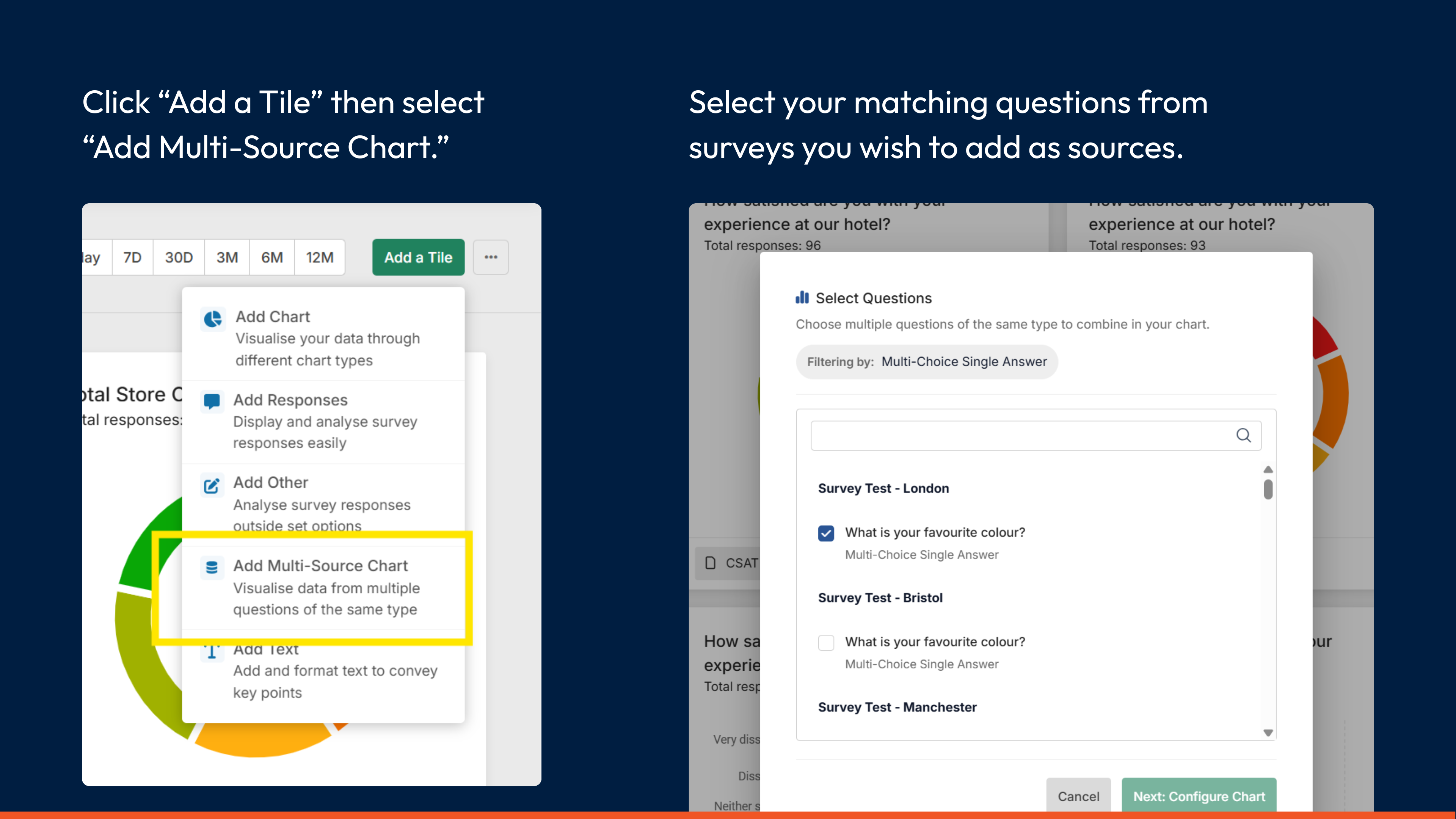
Add a Multi-Source Chart tile from your dashboard's "Add a Tile" menu. Once you select your first question, SmartSurvey automatically filters the list to show only matching question types. This works for:
- All experience metrics (NPS, CSAT, CES, eNPS, ESAT, EES)
- Multiple-Choice Single Answer questions (with matching answer choices)
- Star Rating questions
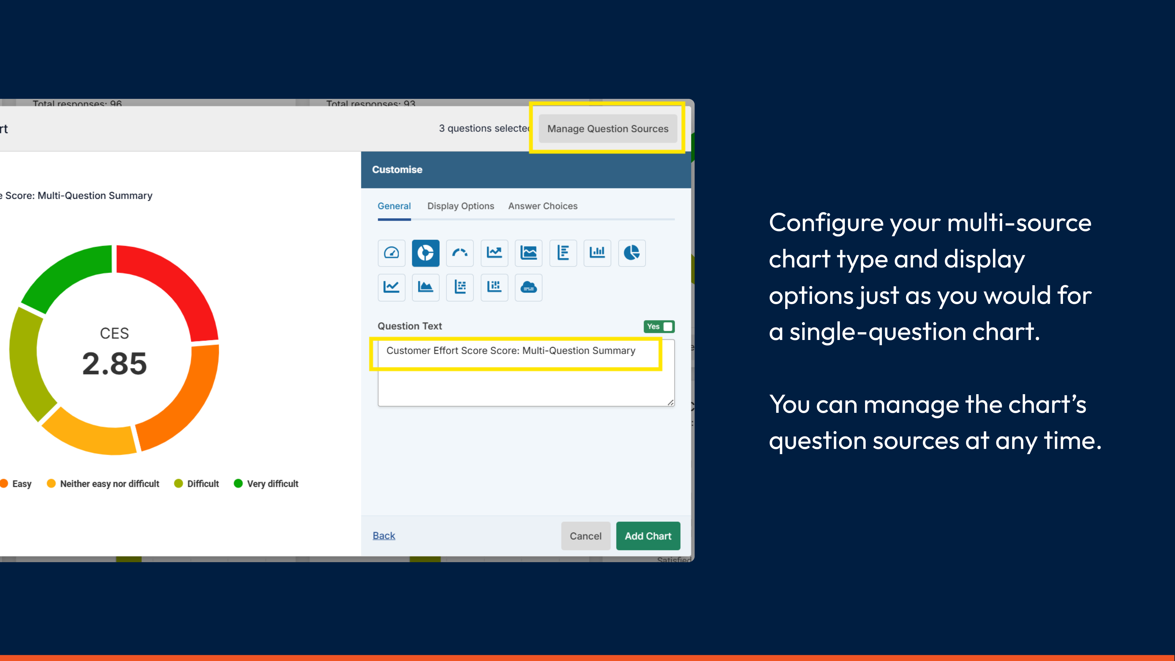
Configure your chart using the same options you'd use for single-question charts. The chart displays total response breakdowns and, for experience metrics, calculates combined scores based on all responses across your selected questions.
Getting started is simple
- Open any dashboard and select "Add a Tile" from the menu
- Choose "Multi-Source Chart" from the tile options
- Select your first question from the list (this can be from any survey you have access to)
- The question list automatically filters to show only matching question types
- Add as many matching questions as you need to your chart
- Configure chart type and display options just like you would for single-question charts
- Customise the chart title to reflect what you're measuring
Multi-Source Chart Tiles are now available on our Full Access plan.
Helpful Links
Elevate your survey game.
Discover the power of our cutting-edge survey software with a personalised demo!

