
How To Analyse Survey Data

Getting a healthy survey response rate is only half the battle to uncover valuable insights. To get to the data that really matters, you need an effective way of sorting and analysing that survey data, which will rely on the data analysis methods and tools you use.
Survey analysis can be a complex topic. So, to help you with this, we’ll explore it in a bit more detail including the main types of survey data and the tools that can help.
Analysing quantitative survey data
Quantitative survey data essentially refers to data that has a numerical value or quantity assigned to it.
To obtain quantitative data, closed-ended questions are used, as they require each respondent to select their answer from a limited group of options. From here the responses to such questions can be evaluated using statistical analysis to reveal qualities and characteristics of a dataset, understand patterns or identify relationships or correlations between data points.
Subsequently, examples of quantitative data could include anything from the number of times a customer has visited a restaurant, to the temperature of a city or the scores achieved in a CSAT survey.
Some popular methods and tools for analysing quantitative survey data include:
Comparing the response rates to multiple-choice questions
One of the simplest ways to analyse quantitative survey data, is to compare the percentage of survey takers who selected each response, to give an overall measure of survey respondents’ opinions.
To achieve this, you simply divide the number of people who chose a specific response to a particular question, by the total number of respondents who took that survey.
For instance, let’s say 100 employees respond to a survey question about what staff benefits they would like to see introduced. If 40 people say ‘health insurance’ which means 40% of them favour such a benefit, you‘ll know it’s crucial to introduce this benefit following your survey.
Cross tabulation
Rather than having to struggle sifting through large data sets, cross tabulation can help you analyse data at a more granular level and more quickly identify what you need.
Through cross tabulations, you're able to group variables together to better understand and measure how they relate to one another.
For instance, with our software the crosstab reports you can produce make it simpler to understand how respondents answer different questions. This is achieved by generating custom contingency tables that display the number of responses for each of the combinations that the two questions can have.
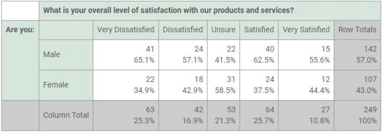
If you consider the above example, which looks to assess the level of customer satisfaction with a company’s products and services, you can quickly see there are some interesting results that could be helpful to investigate further. In particular, the significant difference in satisfaction levels between males and females, with men seemingly more willing to rate an extreme level of satisfaction or dissatisfaction than women.
Metric questions
Another popular quantitative data analysis method is the use of metric survey questions. These rating style type survey questions typically ask respondents to rate their satisfaction, loyalty and the ease with which they interacted with something using the respective CSAT, NPS and CES metric survey questions.
The great thing about these metric survey questions, is that not only are they simple to complete and analyse, but if you keep using them over a sustained period of time, it can provide a valuable benchmark of how well you’re performing. In addition, because many other companies use metrics such as NPS and CSAT, you can compare how well you’re performing with many other companies in your industry too.
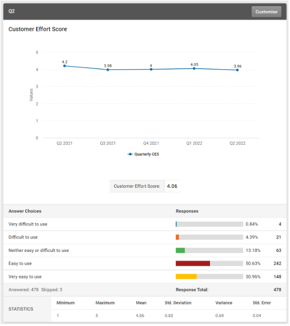
Line charts
As we’ve just discussed, while metric survey questions are a great way of benchmarking your performance over time, such analysis becomes much simpler when you have a visual way of reviewing and analysing this.
Subsequently, whether you’re looking to track changes to your CSAT, NPS or CES over time, Line charts can provide a very effective way reviewing this and quickly spotting any trends that you need to address.
Fortunately, for our Enterprise plan users, who are using our CSAT, NPS or CES survey metrics, they can achieve this with our respective CSAT, NPS and CES trend charts. Using our results summary filter, our chart users can select the time-period for their chart data, which will also be reflected across their whole results view. The volume of data displayed within the chart, can also be changed by selecting years, quarters, months, weeks or days using the "Trend By" menu.
An example of this can be seen in the CES Trend Chart image below
Export options for further data scrutiny
Depending on the business or industry you work in, or your research needs, there may be times when you need to export data from your survey platform into another database for further scrutiny. This is where you need flexible survey software, that also offers a good range of data export options.
The great thing for users on our paid plans is that they can easily export their data from SmartSurvey into all the most popular formats. This includes word/pdf for single response data, XLSX, CSV, TSV, SPSS for bulk responses, or word/excel for a summary report. In addition, they can easily manage their future data exports, as they have the option to create scheduled or recurring exports that automatically run when they need them, and email those that need to be kept informed.
Analysing qualitative survey data
In contrast to quantitative data, qualitative data can be viewed as a valuable tool to help to support, explain and expand on any interesting insights you’ve identified with your quantitative survey data. This is because open-ended questions or free text questions as they’re sometimes known are used to extract qualitative survey data, by allowing people to answer these questions in their own words. This helps reveal and improve understanding of people’s motivations, opinions, feelings and reasons for answering in a particular way.
However, while all of this is great, how do you organise and interpret all the words, emotions and motivations that you collect?
Fortunately, there are some methods and tools to help with this, which we will look at next:
Text analysis
Essentially, text analysis (TA), is a machine learning technique used to automatically extract valuable insights from unstructured text data. This allows those using it to swiftly digest online data and documents and transform them into actionable insights.
For open-ended questions, those with text analysis tools can run them over their survey response data, to search for correlations or popular keywords among respondent’s comments, which they can either group into categories or display as word clouds.
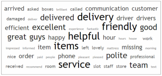
Word clouds
While the ability of text analysis to categorise, tag, manage and display categories of popular response phrases and words is helpful, the ability to convert them into a word cloud can be even more valuable.
Once transferred to a word cloud format it’s much simpler to see the most common words used in responses to a selected question, making it faster to identify key issues that require further investigation. Similarly, with most word cloud tools including SmartSurvey’s, further flexibility is offered with the option to list out all the words, with the number of times they occurred in the response to a particular question.
Track sentiment
While some people remain fairly neutral when they’re providing feedback to open-ended questions, others often express strong views, which can be either positive or negative. So, it’s crucial that you’re able to pick this up and pivot your business strategy and actions accordingly.
The good thing is that there are tools available to help with this, with sentiment analysis among the best currently available.
Sentiment analysis is an effective way to evaluate written or spoken language, as it works to determine whether an expression within a response is favourable, unfavourable, or neutral, and to what degree. In that way, it can provide a valuable indication of how your respondent feels about something, whether they’re a customer, employee or some other stakeholder.
Given that today’s algorithm-based sentiment analysis tools can handle huge volumes of customer feedback consistently and accurately, they’re particularly valuable when you need evaluate a lot of text-based information. And because of this, many businesses use it to monitor customer perception of their brand, products, support and to better understand their customer needs.
How to choose the right survey analysis tool
Having discussed some effective ways and methods of analysing quantitative and qualitative survey data, you’ll want the right survey analysis tools to support you with this.
So, to help you we’ve outlined some key things you need to look out for when you’re trying to identify the right survey analysis tool for your needs.
Ease of use
When it comes to survey analysis tools, you’ll want something that’s user friendly and quick to learn. Doing so will ensure that everyone can use it and you can swiftly maximise the value from your survey’s insight.
Besides the ability to analyse your survey responses historically or in real-time, the design should make it simple to use, with drag and drop functionality, automated features and menus that are straightforward to use.
Fortunately, all of this is available with our data analysis tools, that have been built with all users in mind.
Ability to visualise data (both quantitative and qualitative)
As we already touched on earlier, if you’re to uncover the greatest value from your survey insights, you need tools that will allow you to analyse quantitative and qualitative data effectively. In essence, the ability to visualise both numeric and word-based content.
From bar, column and pie charts to line graphs, trend charts and key metric gauge charts. Depending on what price plan they’re on, SmartSurvey users can get some or all of these options, which can help provide a quick snapshot of the most important insights from their quantitative data. Similarly, analysis of qualitative data is made much simpler with the availability of text analysis and word cloud tools for those on our paid plans.
Capacity to calculate statistical data
Time is of the essence when you’re analysing your survey data, so any features that can save you time, particularly when it comes to data calculations will be hugely valuable.
It’s why we’ve built in the ability for our users to calculate standard statistical information relating to their data. So, when they’re dealing with quantitative data, they can quickly work out the minimum, maximum, mean, standard deviation, variance and standard error values for the data sets they’re reviewing.
Ability to filter and sort data
Whether it’s filtering your data by survey questions, answers and contact list data, or using filters to improve your survey reporting or data export process. Whatever it is, the ability and flexibility to filter and quickly sort through your data is an essential requirement for any survey analysis tool.
Once again, all of this functionality is built-in for users of SmartSurvey, who can collect data about a wide array of data subjects and easily split them out into groups for reporting, using our filtering tool.
So, whether you’re filtering your results by your survey questions and contact data, or applying filters to your reports, tracking links, exports and more. All of this is possible with SmartSurvey.
Customisable options
The more customisable your survey analysis tools are, the better. And while we’ve already discussed the benefits of using filters, you can get to what really matters in your data quicker, when you have more options to customise your main survey report.
For example, depending on the plan that they’re on some SmartSurvey users have a lot of options for creating custom report views. Options include the ability to include or exclude questions, show or hide elements for free text questions, apply filters and other customisation options. There is even the option to save these selections and return to them at a later date.
The inclusion of survey dashboards
When it comes to your survey data, one of the most important things is being able to see all your important data, in one place, in a way that best suits you.
Consequently, one of the biggest advancements to help users has been the emergence of the survey dashboard, which is now an absolute must have for anyone looking for survey analysis tools.
The very best dashboards tools include:
- The ability to view everything in one place, but in the way that you want. This is easily achievable if you’re able to drag and drop charts and responses and alter the size and layout of the tiles on your dashboard grid.
- The capacity to monitor, compare and analyse results side by side. Again, you can achieve this if your dashboard is fully customisable, and it allows you to easily set up filters and adjust date ranges.
- The benefits of always being able to see the big picture on your data. This is attainable if you’re able to view your real-time data and visuals alongside one another and share that dashboard with everyone else that needs to see it.
Fortunately, all of this and more is available with the new Dashboards feature from SmartSurvey.
The right support
Finally, no matter what survey analysis tools you’re using, there will always be times when you’re likely to need some level of support. So, it’s always useful to identify upfront what degree of support you would receive from your prospective provider.
Of course, your level of support will depend on what plan you’ve signed up to. However, with some detailed research and probing your prospective provider with some direct questions, you should get a better idea about the support that’s available on different plans.
To help you with this, here are some things you need to be asking yourself including:
- How friendly and helpful are their staff?
- How response is their service?
- How knowledgeable and effective are they with managing and solving support issues?
If you can do this, you’ll be in a much better position to identify the best tool and plan for your needs.
Final thoughts
Having explored some of the key areas of survey data analysis, I’m sure most of you will agree, it can be a complex topic.
However, once you understand the main survey data types and the best ways of analysing them, you’ll be much better able to understand and interpret your survey responses.
So, if you’re haven’t already done so, now’s the time to get your survey data analysis processes in good shape.

Neil has a deep understanding of software and how to bring its value to market. With experience across Human Capital Management, Learning & Development, AI-powered platforms and omnichannel communications, he knows what it takes to connect solutions with real business needs. Neil’s passionate about helping organisations turn insight into action and elevate the customer experience.

