
6 Best Practices For Creating Effective Survey Dashboards

When it comes to your survey results data, imagine being able to view everything in one place, just as you like it. Then monitoring, comparing and analysing different results side by side, so you’re never missing your most important survey insights. Well, all of this is now achievable with SmartSurvey’s new reporting tool; a survey dashboard feature called, appropriately, Dashboards.
From your subject matter and your audience to considerations around form and functionality. There is lots to think about when you’re trying to build and layout a new survey dashboard.
So, to help you get the most value from our Dashboards, we’ve put together the following best practice tips for creating an efficient and effective survey dashboard that can best meet your needs.
1. Understand your stakeholders' expectations
Before you do anything else, you need to consider the level of detail and information that your decision makers and stakeholders will require.
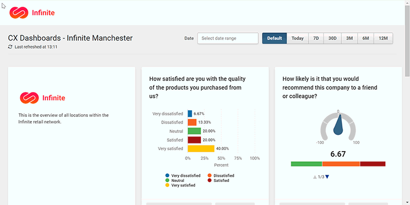
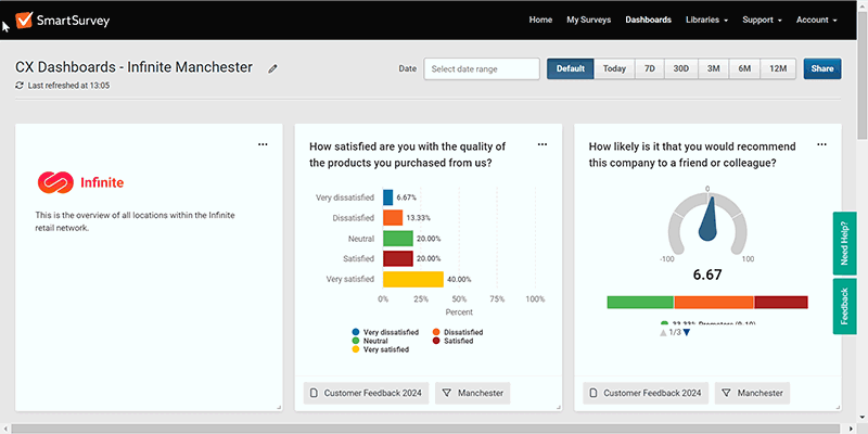
For example, the layout and volume of tiles, charts, response data and supporting imagery that you use is likely to be different for a board of directors than a customer experience team. While the former may only need to see some top-level KPI metrics like NPS, the latter group may need to view KPI metrics alongside supporting trend charts and sentiment analysis of open text boxes. Such a combination of charts in a CX dashboard would enable the customer experience team to more quickly identify and manage issues as they arise.
The key thing is to only include what’s essential to your audience. So, rather than risk overwhelming them with unnecessary information, which could cloud their judgement, they’ll quickly see what they need to take the most appropriate actions.
2. Choose the right charts
Given that visuals are typically processed 1000s times faster than words, it’s vital that the charts you’re displaying on your dashboard are best suited to your audiences’ needs.
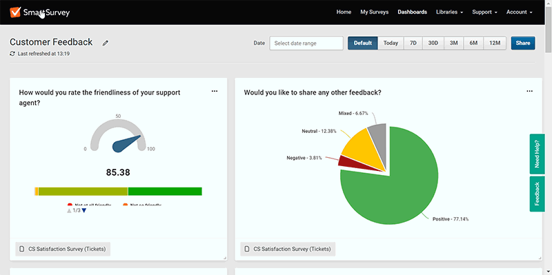
From bar, column and pie charts to line graphs, trend charts and key metric gauge charts. There are a wide range of visuals you can select to display your survey results to provide a quick snapshot of your respondents’ thoughts or see how sentiment is changing over time.
So, whether your dashboard’s audience needs a real-time top-level view of what’s currently happening with your customers, or something more historic, to help make comparisons and guide your strategy. You need to ensure the visuals you’ve pinned to your dashboard are the right ones for your audience, to help them make the decisions and actions they need to take.
Having decided which charts you want to display; our dashboards feature makes this simple to do. You can easily drag and drop key charts onto your dashboard page from your survey’s results summary using the pin icon that’s displayed above every question.
3. Place items in the best way
Whatever you’re using your survey dashboard for, you’ll want to ensure that your most important data points are always easy to locate. That way, you’ll always have the best information to hand to inform your decision-making.
Ideally, you’ll want to place your most important data items where they’re most prominent, which is typically at the top of your dashboard page.
For example, if you were a customer experience manager running ongoing survey questions to measure your NPS and CSAT score, you may want to pin the respective metric gauge charts for these to the top of your dashboard grid. Underneath this you could place open text boxes to view ongoing sentiment to related questions. That way, you would always have an effective real-time overview of what was happening with your customers and be able to address any issues, before they became more problematic.
The great thing about our survey dashboard is that it’s fully customisable. So, however you choose to layout your dashboard, the location and size of your chart and response tiles can be quickly and easily arranged to suit your needs.
4. Make good use of filters
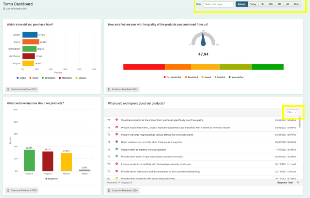
We all know the value of using filters in our survey results, to quickly uncover trends or correlations in our data, which can serve as new opportunities or issues we need to fix. Well, similarly such functionality should exist in survey dashboards too, as they can allow busy professionals to quickly get to the insights that matter most to their business.
Fortunately, if you’re using our survey dashboard this is all easy to achieve, with the ability to select specific filters and date ranges. With the filter tab that’s present at the bottom of each dashboard tile, it’s simple to make comparisons across filters, surveys and date ranges. And if you quickly need to monitor all your dashboard tiles for a specific date range, you can set this up using the date range bar at the top of the dashboard.
Such functionality can be hugely beneficial for a range of scenarios. For example, if you were a customer service manager looking for data evidence to support a historic customer issue, you could use the date range filters to check incoming customer survey feedback. By selecting a particular data range, you could quickly check if there was any feedback to support your hypothesis.
5. Incorporate your branding
Whether you need to comply with your organisation’s company guidelines or maybe you work for a market research agency, that runs surveys for a range of different clients. There are plenty of scenarios where you may need to brand your dashboard to comply with yours or your clients’ needs.
Similarly, to how branding your survey can help improve your survey response rates, there are many benefits to be gained from a branded survey dashboard. Not only does it look more professional, but much like a branded survey, recipients will immediately recognise it, which helps build trust and encourage them to interact with it.
With our survey dashboard, branding is easy to set up within the survey app, with the option to add your own custom logo, as well as change the background colours to best fit with what you need.
6. Make your dashboards sharable
In todays ever more connected, data driven world, different groups need to be able to access the same information, if they’re to collaborate and work effectively together. So, the ability to share your survey dashboards is crucial, if you’re to get the greatest value from its data.
From improving your understanding of your survey data and working more effectively on data with others, to saving time and money that might otherwise be lost if different teams were left working in isolation. There are lot of advantages to be gained when shared dashboards allow you to see the bigger picture and you’re able to break down data-silos.
Fortunately, with our survey dashboard, keeping team members, departments, clients and other stakeholders updated and informed about your survey activities is easy. This is because besides sharing your dashboards with other users on your account, you can share it with external groups, via a public URL link.
Final thoughts
We hope you enjoyed reading our best practice tips.
Whatever stage you’re at with your knowledge of survey dashboards, we hope you’ll be able to incorporate some of these ideas to get your dashboards working more efficiently and effectively for you.
The key thing to take away from all of this, is that however you’ve decided to set up your survey dashboard, it needs to work not only for you, but everyone else that’s likely to be using it. So, before you make your dashboard available to other users, it’s a good idea to make additional time to review and collect input about it from other team members, before you go live.
If you can do this, you’re more likely to achieve the best outcomes with your survey data, which will help your decision-making and actions moving forward.

Neil has a deep understanding of software and how to bring its value to market. With experience across Human Capital Management, Learning & Development, AI-powered platforms and omnichannel communications, he knows what it takes to connect solutions with real business needs. Neil’s passionate about helping organisations turn insight into action and elevate the customer experience.

