
How to Present Survey Results

Having worked hard on your survey design and achieved some great results, you’ll want to maximise their value with those who matter.
While a downloadable or emailed survey report, is the more traditional way of presenting your survey results, there are better and more engaging ways. And one of the best of these is through a live, stand-up presentation.
Whether you’re presenting to employees or some other stakeholder group, communicating your survey results via a live presentation, helps drive greater engagement and collaboration. Subsequently, this can help to bring about better decision making and actions as a result.
However, before you do anything else, you need to think about the structure and delivery of your presentation, if you’re to best meet your aims. So, that’s what we’ll look at next.
Presentation structure
When it comes to the presentation and communication of survey results, some of the best results are possible when they are presented like a story.
Ultimately, when you create a survey, you will have an overall objective that you want it to achieve. You will also have some actions in mind that you will want your audience to take when you present your results to them.
So, by adopting the following presentation structure, you’ll be better able to communicate the key findings to your audience. This will also help enable them to take the most appropriate actions as a result.
What’s the most crucial issue?
Whether you’re trying to identify the key drivers influencing your employees’ engagement levels, or satisfaction among your customer audience.
Whatever burning question you’re trying to get answers to with your survey. By focusing on it and making it your key theme, you’re more likely to engage and grab your audience’s interest from the outset.
What does the data mean for your audience?
Besides thinking about how much detail you need to go into, you also need to consider the impact of your data findings on your audience.
While they will be keen to hear about your survey’s findings, they’ll be more interested to know how this might impact their work or life. So, do communicate what the data means for different audience groups and any subsequent changes you propose to make, when you’re presenting your survey results.
Communicate any actions you need your audience to take and the benefits of taking them
Whatever audience you’re presenting to, having outlined the data findings and conclusions from your research, it’s likely they’ll be actions you need them to take.
Whether it’s fresh activities you want staff to get involved in to increase their engagement, or new processes you need them to learn to improve customer support. Whatever the actions, these need to be communicated clearly, along with the wider benefits for staff and the organisation, to encourage their participation.
Smarter online survey software
Capture data and opinions from the people that matter most – your customers, your staff or your students – with the use of smart, flexible online survey software. Free and paid plans for every budget.
Using visuals to bring your data to life
Besides your presentation’s structure, you also need to be thinking about the visual elements that will help bring your data and story to life.
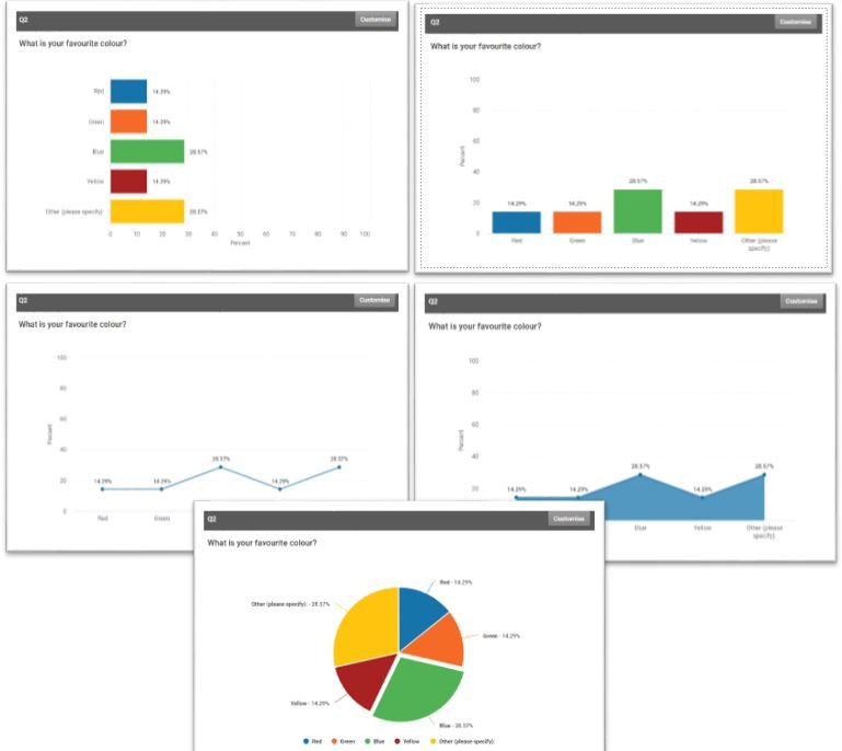
Graphs and custom charts
When it comes to illustrating your survey findings, whether that’s statistics, a visual breakdown of how different groups answered a question, or a mix of both. Whatever it is, the use of graphs or custom charts such as bar, column, line, area or pie charts can really make it stand out. It can also make it more appealing and easier to read.
Putting the focus on numbers
Depending on your story, the data you need to communicate and the composition of your audience, you may want to put greater emphasis on hard numbers and statistics. This will certainly be the case if you’re presenting to many people in leadership roles, who will want to see hard quantifiable numbers in your presentation.
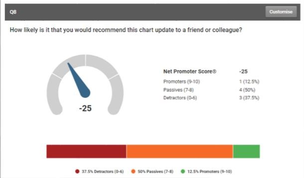
Besides the obvious methods of providing the number of respondents and percentages for responses, you should consider including some visible and tangible metrics.
For example, if you wanted to highlight levels of satisfaction among your customer base, then you may choose to illustrate this with dashboards for your customers’ NPS and CSAT scores. Alternatively, you could replace this with an eNPS dashboard, to get a better sense of how happy staff were working for your organisation (see our Employee Net Promoter Score calculator for an example).
Real-time visuals
You also need to think about the supporting visuals you can use to show live data results as they are coming in.
From PowerPoint and Google Presentations to Prezi and Empressr. There are a whole host of presentation tools available with features including animated gifs, which you can use to bring your presentation and data to life. Such tools are great for encouraging further collaboration and discussion among your audience.
Analysis of qualitative data
It doesn’t matter what you’ve been researching, at times you’ll want to look beyond the top-level stats and get more in-depth details about what people are actually saying.
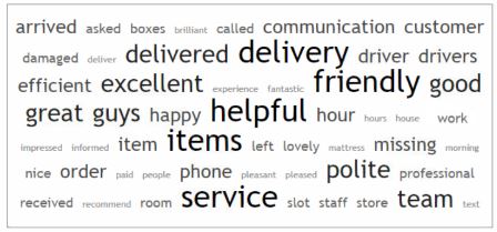
Text analysis is an innovative and useful tool that enables you to do this.
When activated the text analysis feature allows you to comb through the text responses to open ended questions, to look for correlations or popular keywords that appear in respondents’ comments. Once gathered these can be displayed in a Word Cloud, making it simpler for your audience to examine and interpret. It also allows greater insights to be gleaned from the data.
Remember you’re delivering insight not just data
The key thing to remember when you’re presenting the findings of your survey, is that you’re there to deliver insight not just data.
Ultimately, you will have an overall objective that you’re looking to achieve and actions you want your stakeholders to take. And they’ll be more likely to do this with an interesting and engaging presentation of your findings.
By examining and incorporating some of the guidance we’ve offered in this blog piece, you’ll be better able to deliver what you and your stakeholders need.

Neil has a deep understanding of software and how to bring its value to market. With experience across Human Capital Management, Learning & Development, AI-powered platforms and omnichannel communications, he knows what it takes to connect solutions with real business needs. Neil’s passionate about helping organisations turn insight into action and elevate the customer experience.

