
View, export and report
This class covers reporting functionality. From comprehensive cross-tabs to filtering and automated reports, we’re covering it all.
Class 8: Reporting and Exporting
The whole point of going to the effort of creating online surveys is to collect data that you can then interpret into some form of insight, intelligence, or information that’s then used to inform the decisions you need to make. So, in this masterclass, we’ll talk about some of your options for viewing, exporting, and sharing the data that you gather using SmartSurvey.
Summary Reports
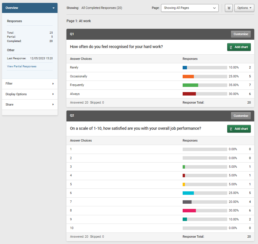
The heart of the reporting system is the summary report that you can access via the “Results” tab of each survey. This will show you the aggregated data from all the completed responses for the survey, both as numbers and simple bar charts. It’s ideal for getting a quick feel for what the results are, and the data is updated in real time as your responses come in.
Inside the summary report you’ll also have the option to create custom charts for your questions, and save these as image files to use outside SmartSurvey.
You can create a word doc version of this report by simply clicking “Send to Word”. This appears in the upper-right of the page, and if your requirements are simple, that may be all you need to do apart from reading and digesting the results. If you want to take things a little further, there are some extra options available.
In-App Analysis
The summary report also includes some extra features. Key analysis shows some automatically calculated statistical measures for your data such as mean, variance, standard deviation, standard error and a calculation of “satisfaction rate”.
Cross-tab reports are also available in the app. These generate tables showing how the answers that were given to one question compare and relate to those given to another. This is a process often performed by doing an export to excel or another spreadsheet and creating a pivotable, so having an in-app solution can be a real time saver.

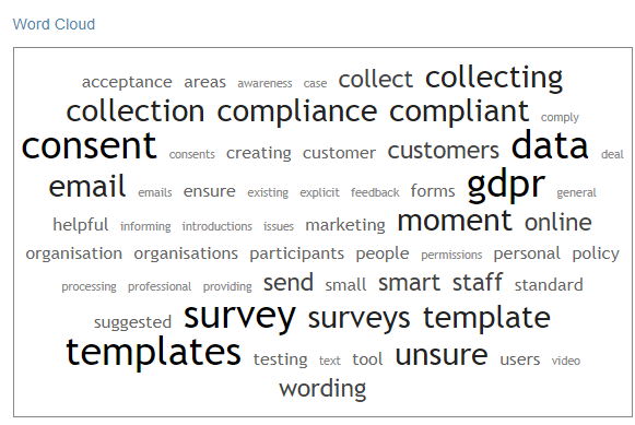
For Enterprise users, there’s also text analysis, which will automatically generate a word cloud for the most frequently-used words in the free-text answer to which it’s being applied and allows in-app categorisation of answers allowing them to be processed and analysed without needing to export data.
Filtering
The filtering tool allows you to create one or more filters that apply rules to define which responses are included (or excluded) from the summary report. These rules can be based on the answers that are given to the survey, dates and times of completion, Custom contact list columns or variables, or even specific IDs.
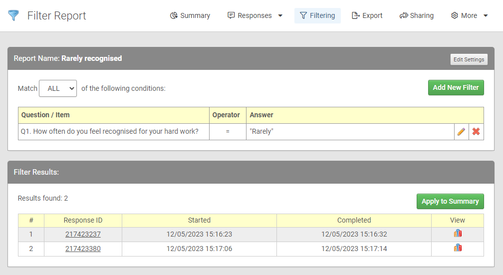
Once a filter has been created it can be easily applied to the summary report and used for other functions such as exporting.
Exporting
While SmartSurvey contains powerful in-app reporting tools, there often comes a point where you want to download the data into a spreadsheet for detailed processing.
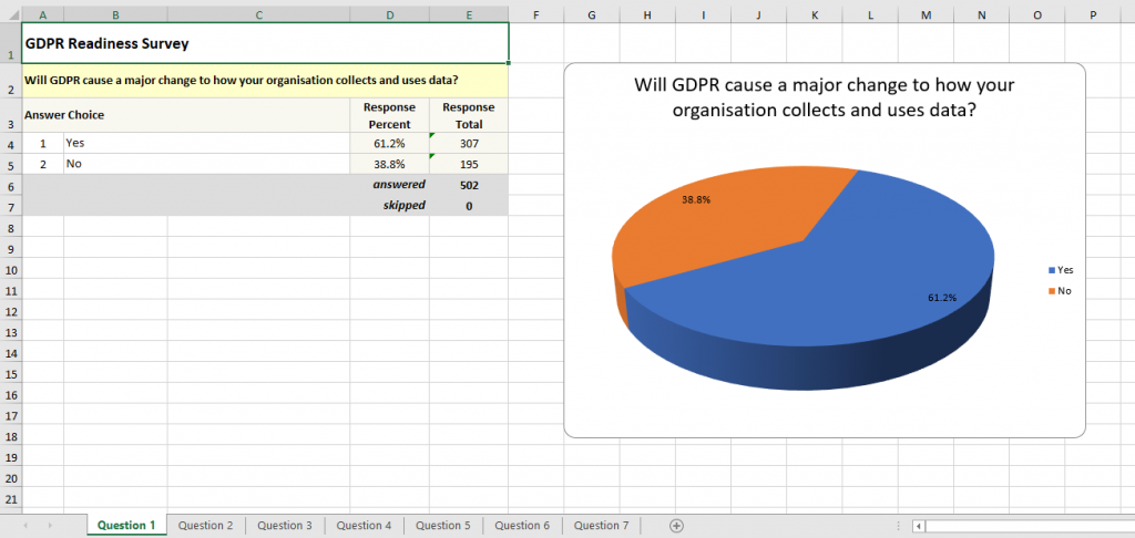
The first option for exporting is creating an Excel version of the summary report. This can make an excellent basis for creating PowerPoint presentations of survey results as the data is already tabulated and charts have been created, and can be directly copied and pasted into a presentation, customising them if desired.
The data can also be exported in the form of the raw responses so that all processing can be done in the application of your choice, whether that’s direct to Excel or in CSV format which is universally accepted for upload into other tools.
Automation
Any of the export options can be set to run on a schedule, meaning that reports for ongoing surveys can automatically generate reports for a period as long as you want it to. These reports can also be automatically emailed to any email address, saving the work of having to go and “get the latest numbers” every week as SmartSurvey will send them to however you set up. These exports can also have their own filters applied for a fully automated, customised report for anyone that needs one.
In Practice
What this means is that’s it’s possible for someone to set up detailed automated reporting chains.
If we go back to our example of a restaurant – Let’s imagine we’ve now expanded our business (thanks to our relentless focus on using customer feedback to make improvements) into a chain of restaurants. We’ve created our feedback survey so that each individual location has its own tracking link. We could now set up the following automated reports that can all run automatically:
- An automatic summary report for the manager of each location. This will send out weekly and uses a filter to only show the responses that relate to their location.
- An automatic summary report for overall managers that includes all the data gathered by the survey, that also sends out weekly.
- A monthly export off all the raw responses for further processing if needed.
This can all run off the same survey with no intervention needed and as new locations are added, then they can feed into it in the same way.
Moving Forward
The example of a restaurant is just used as we’ve been using a bit in this series, but it’s just as applicable to any large organisation and could be applied to departments, business areas, or any other way really that an organisation can be looked at in terms of its various components.
These last few features are of course of most use for people working in large organisations with multiple stakeholders, and so this leads us on naturally to features that support team working, which will be the subject of the next in this series.

